SCSU Huskies Rebrand Concept
Self-initiated
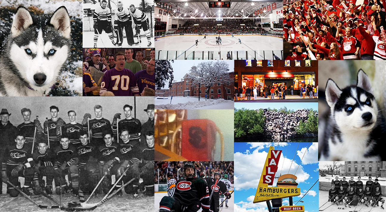
Self-initiated rebrand concept for the St. Cloud State University Huskies. St. Cloud State is the second-largest school in Minnesota and is home to the Div.1 Men’s (1987) and Women’s (1998) hockey programs. Although SCSU may not have the same storied histories like that of it’s in-state rivals, St. Cloud State hockey is a program with a promising future.
I attended SCSU from 2009-13 and always felt that there could be improvements made to make a more cohesive and modern branding system. While working on this project, my goal was to keep close to the traditional look of St. Cloud State Huskies hockey, while also making updates to bring it to the standards of modern sports design.
Note: This is a piece of concept art only. These logos are not official marks nor do they represent St. Cloud State University, the NCAA, or the NCHC.
- Photo Credit: Brace Hemmelgarn – Incredibly talented photographer
- Photo Credit: St. Cloud State University, NCHC
- Historical Credit: Vintage Minnesota Hockey

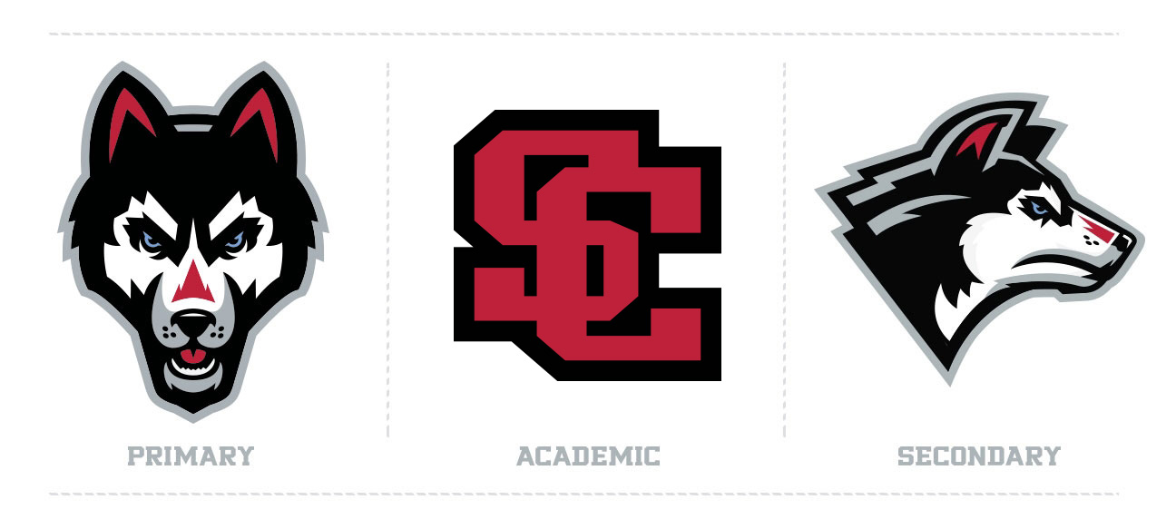
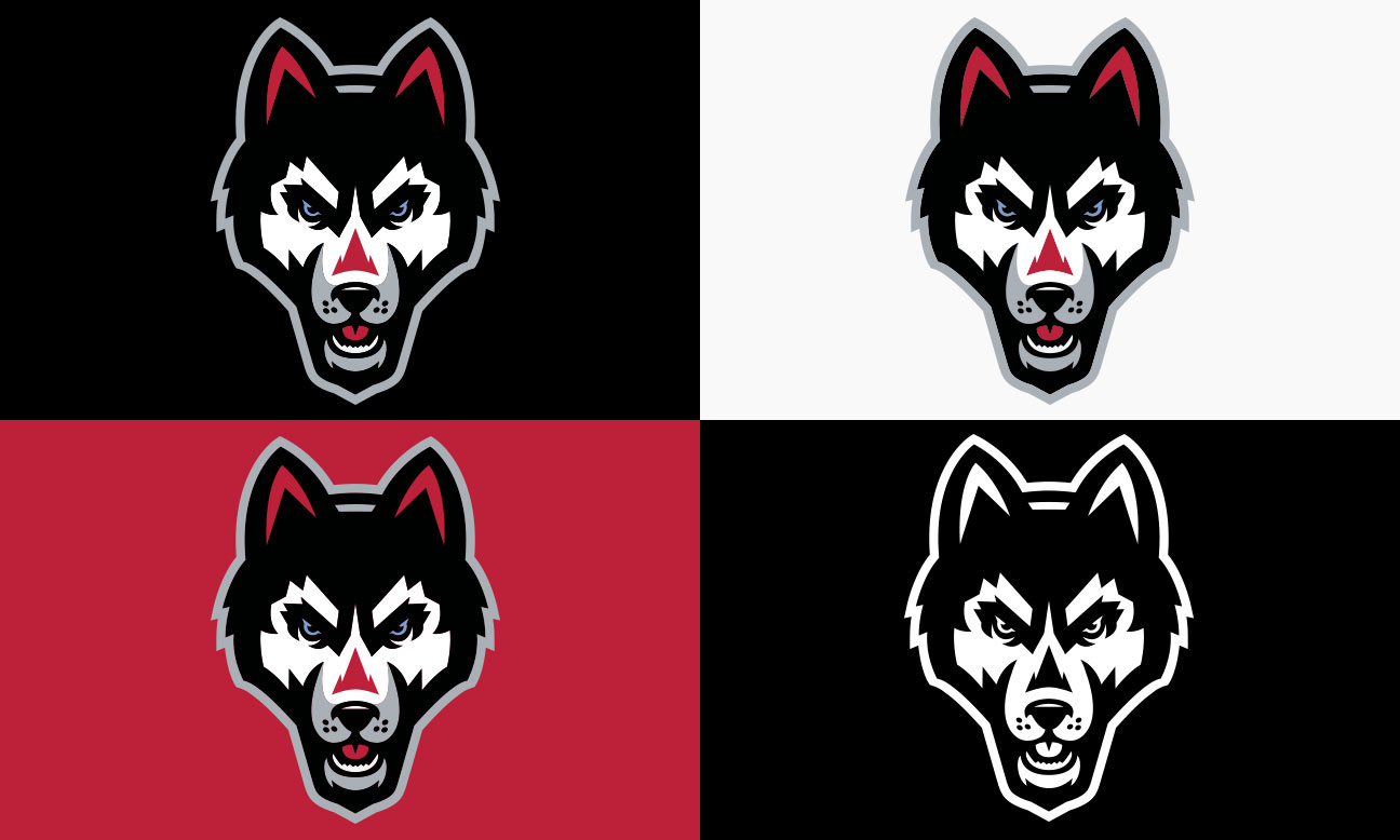
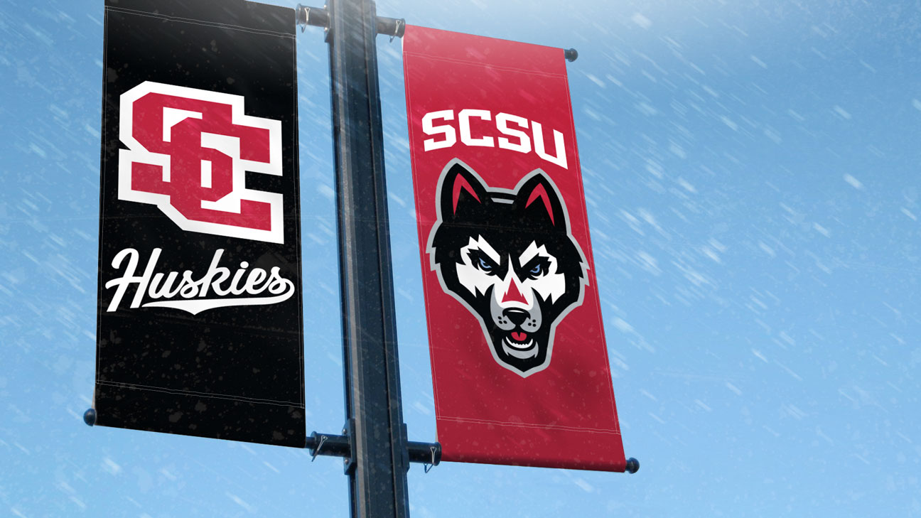
Primary Logo Concept

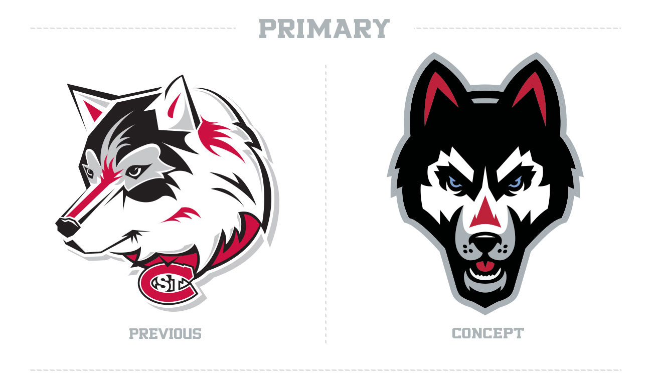
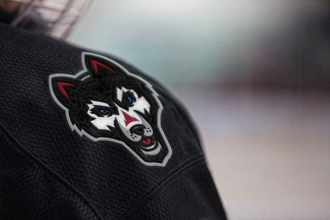
The previous mascot logo was very complex and had some cluttered areas. The husky appears to be looking downward, which to me, always read as being too docile. The concept piece has brought on thick lines and a front-facing growl that brings an aggressive quality to the primary mark.
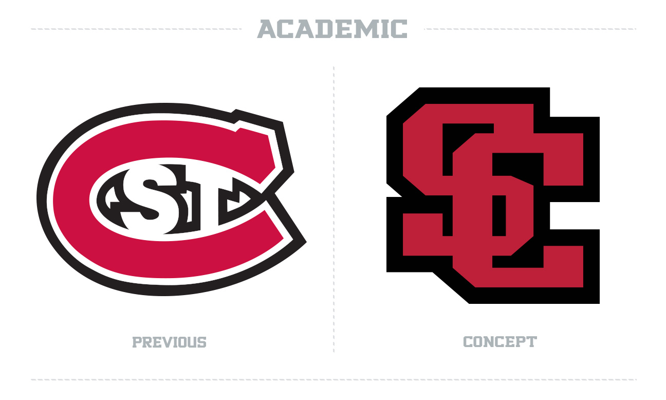
While attending and working for St. Cloud State, the “St.C” academic mark always bothered me. I understand that the logo has been around since the 1980’s and has built up brand equity in the region, but it just looks way too similar to the Montreal Canadiens of the NHL. The concept logo is a revised version of a previous St. Cloud State logo that was used before the “St. C’, meant to tie back to SCSU’s past with a modern look. (For reference, see the letterman’s jacket in the center of the moodboard).

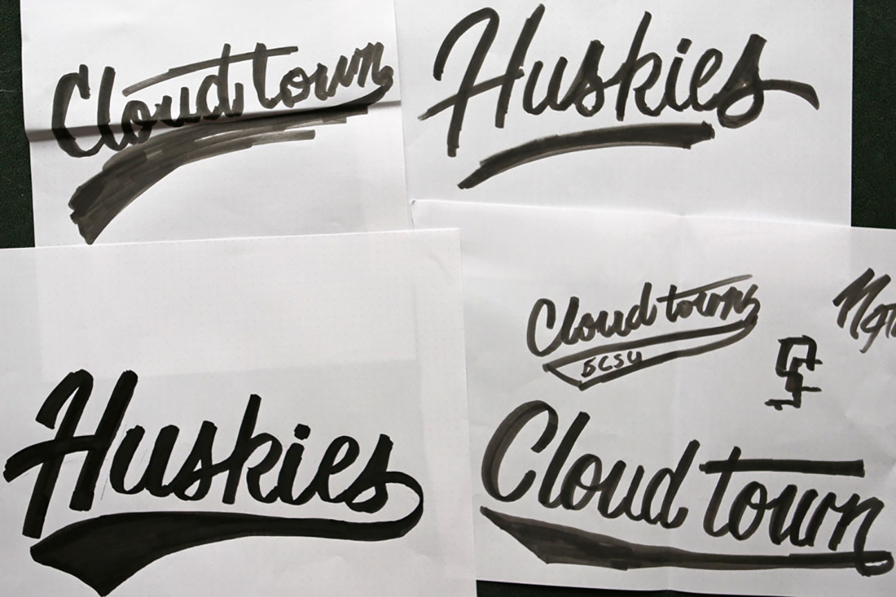
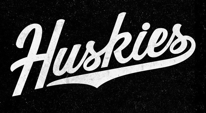
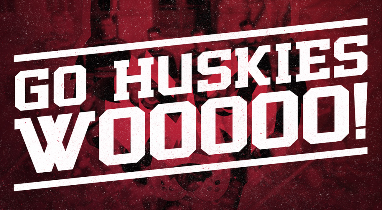
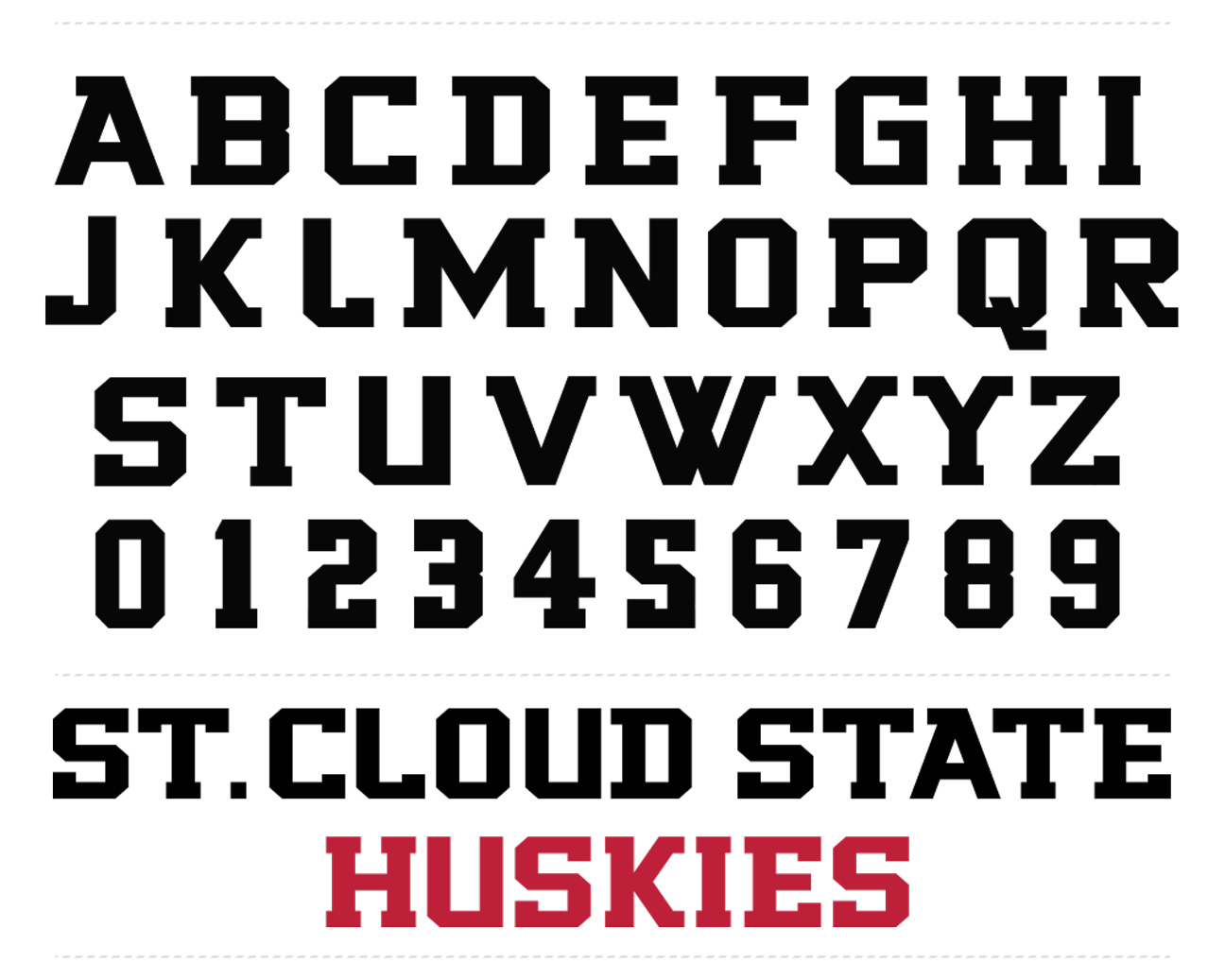
Hand-lettering for alternate jerseys patches and apparel

Custom typeface based off of the revised logo

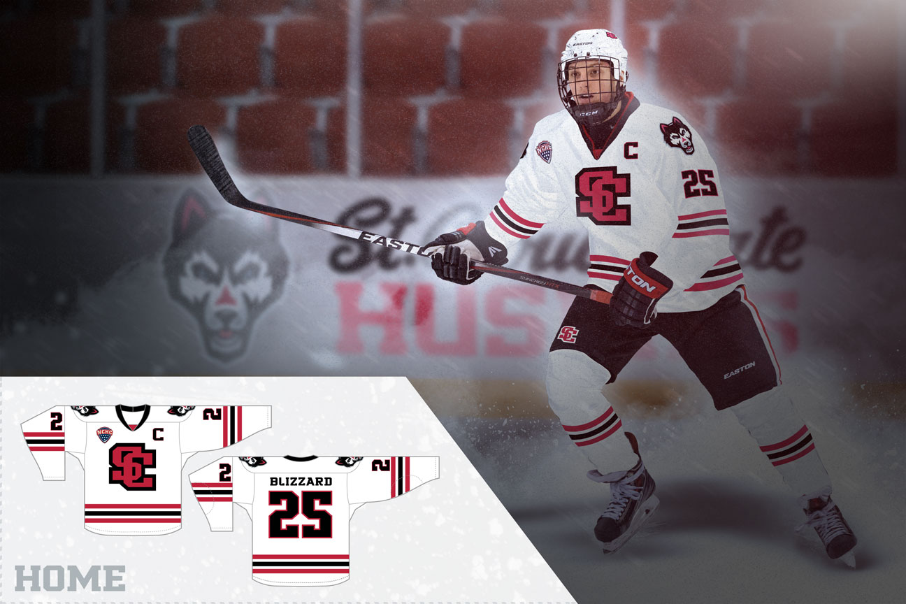
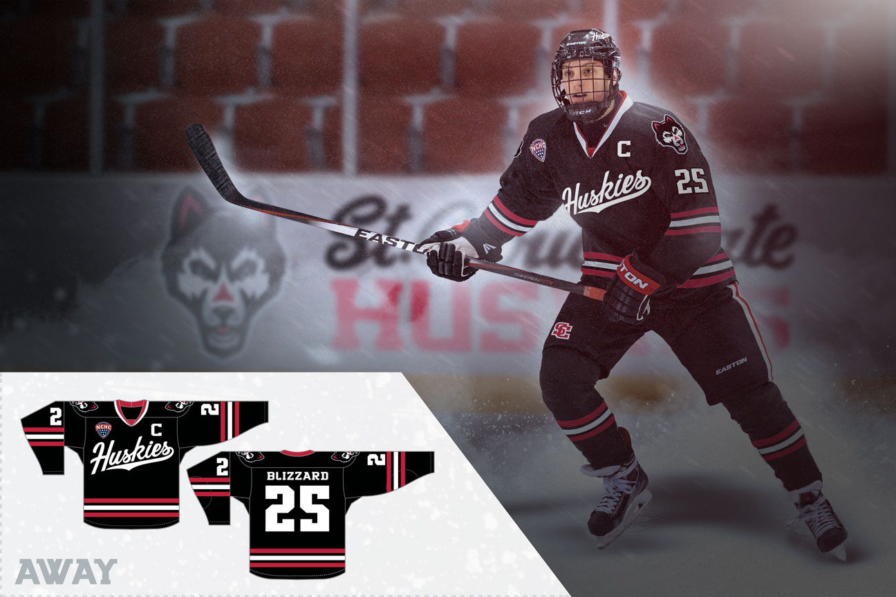
When thinking about revising the SCSU jerseys, I wanted to stay pretty close to the team’s current look. The thing I like about SCSU is that the team’s uniforms don’t have any ridiculous designs or extraneous piping. The Huskies keep it minimal and take advantage of their great color scheme. I simply wanted to add the new logos, wordmarks, and typefaces to the old jerseys, and bring in some fresh alternates that combined the historical looks with the modern jerseys.
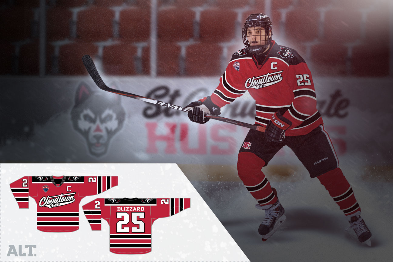
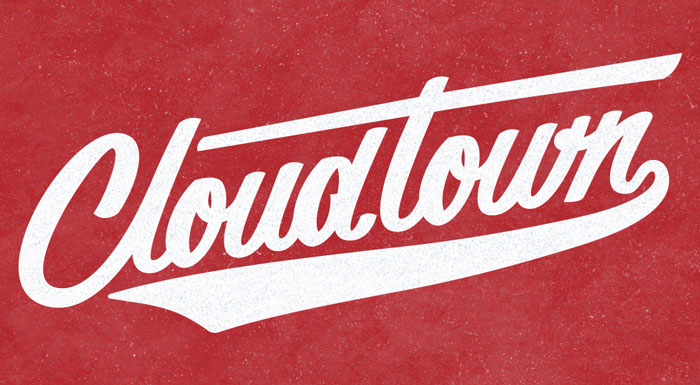
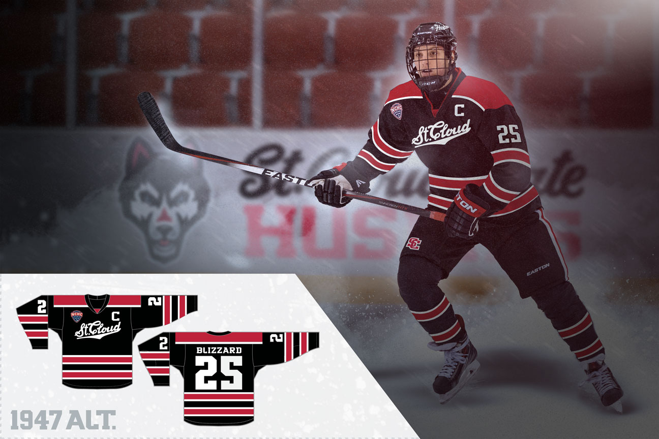
“Cloudtown” Alternates – A nickname for St. Cloud, this jersey would be worn as an alternate for big games at the HBNHC. Inspired by some of the aesthetics of SCSU uniforms from the 1930’s-50’s.
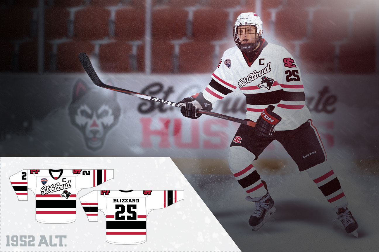


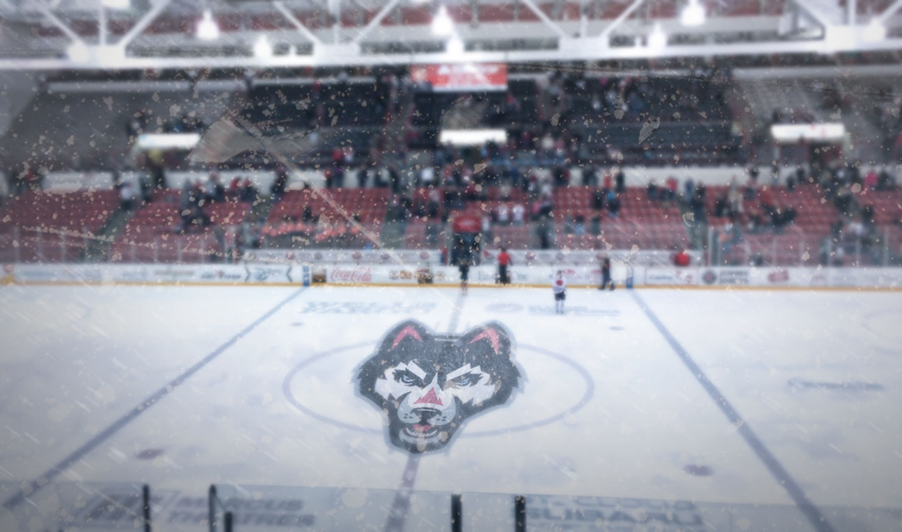
Herb Brooks National Hockey Center, named after the legendary Olympic coach from Minnesota. Brooks was the head coach at SCSU in 1986-87.
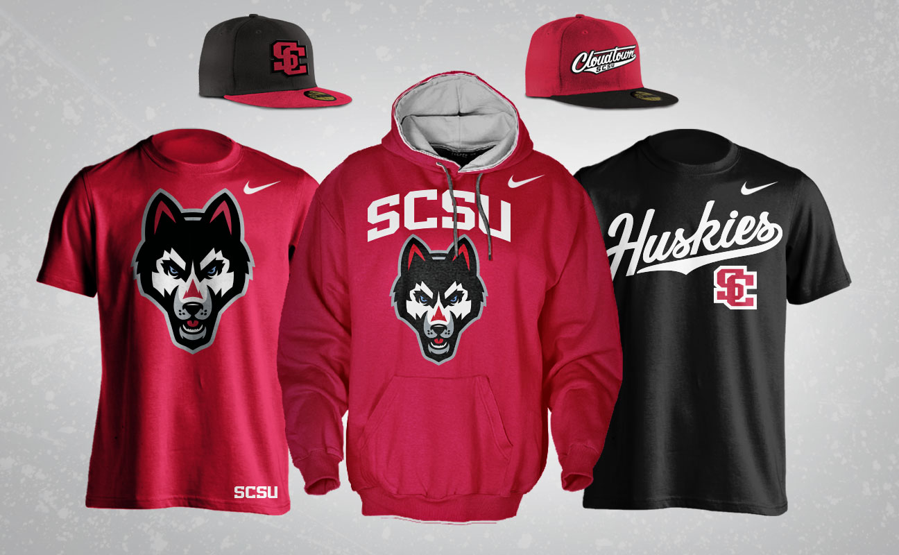
Apparel mockups

Billboard design
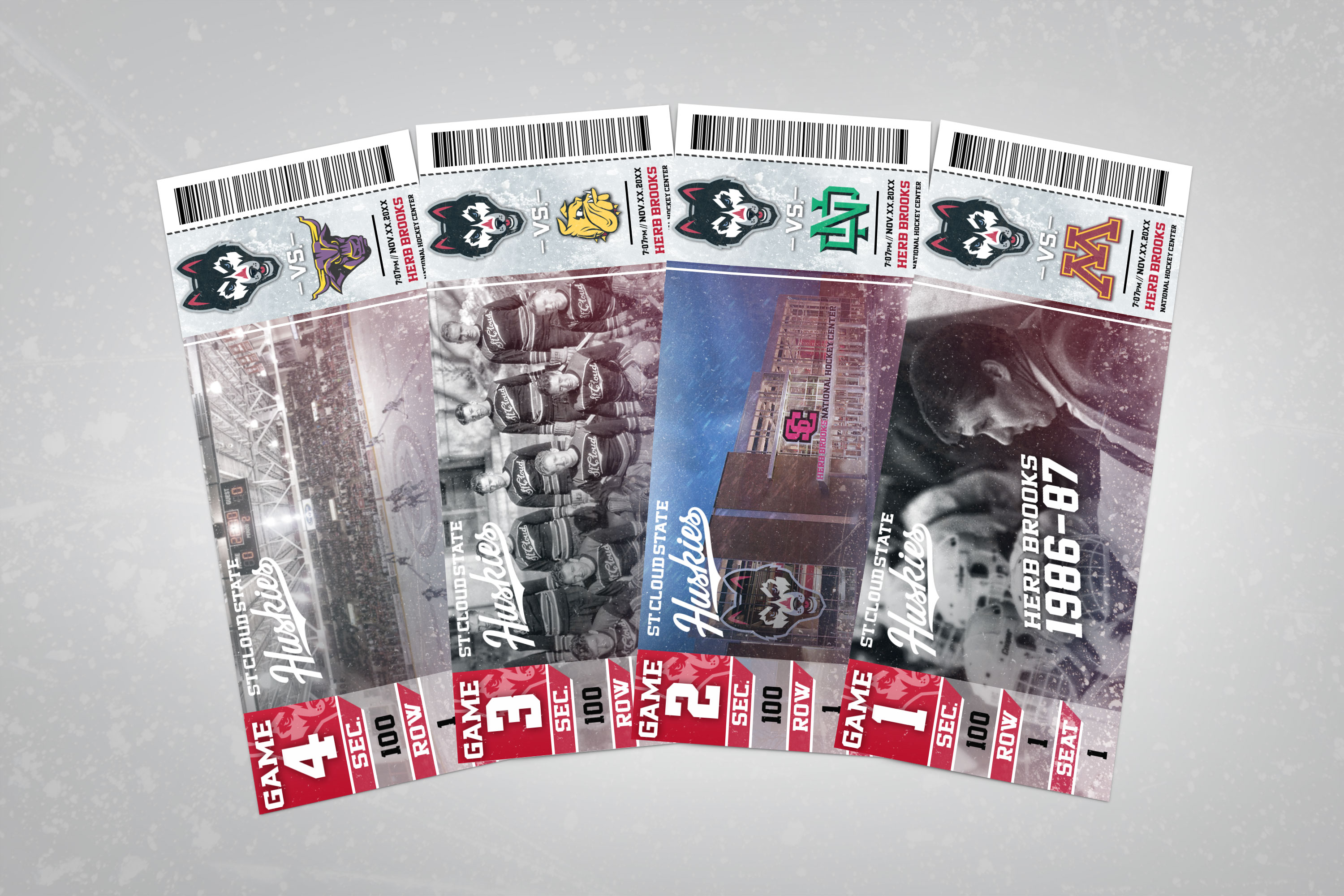
Ticket design
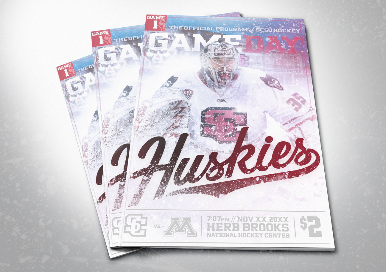
Game program design